Dynamic Symmetry Overlay in Lightroom
I’ve been reading composition books and blogs in an attempt to discover new ways to organize the frame. One of those ways that I’m currently experimenting with is called dynamic symmetry, and is discussed extensively on James Cowman’s blog.
In this post, I’m exploring how to add the dynamic symmetry grid as a custom overlay in Lightroom.
Lightroom Loupe Overlays
At the time of writing, Lightroom CC is in version 2015.5.1 (1073342).
Lightroom comes with several crop guide overlays, but unfortunately the dynamic symmetry grid isn’t part of them. Although there is no way at the time of writing to customize the overlay grids, another feature can be exploited as a workaround: loupe overlays.
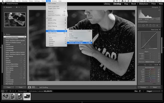
The original goal of this feature is to put an image in its context of use, such as adding all the surrounding text of a magazine cover. You will find this under the View menu:

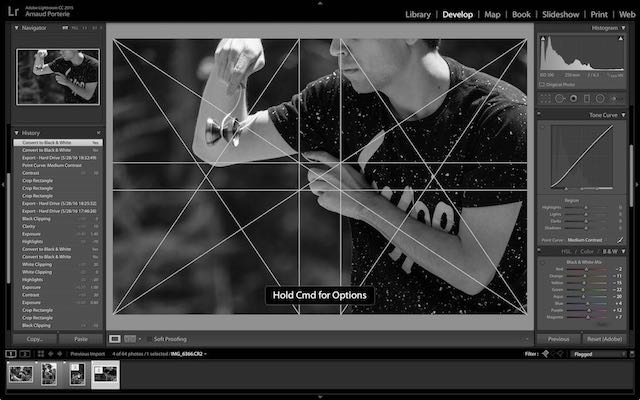
By creating a set of custom images, we can use this feature to our advantage to overlay a dynamic
symmetry grid, using the Command + Option + O shortcut to toggle it:

Issues and limitations
At the time of writing, the feature is unfortunately super buggy, and seems to crash Lightroom only minutes after being enabled for the first time.
Another minor problem is that loupe overlays doesn’t follow the image orientation. In other words, you need both a horizontal and vertical grid images and manually switch between the two.
Download the overlay files
I created different flavors of the grid, for either light or dark lines, and horizontal or vertical orientation:
