I joined Veepee as VP Engineering after leaving a Senior Engineering Manager role at Docker in mid 2017 with the goal of learning what it takes, and testing my own capabilities, to lead a large scale engineering group. What started as a journey as VP Engineering over a Paris-based organization of 180 ended as Deputy CTO over a European-wide group of 900. There’s no way I could document all the learnings at once, so I’ll start at the very beginning and the first surprises.

Structuring an organization

The first 6 months were what anybody would expect: lots of observation to understand the system and its dynamics, defining a healthy organization based on clear roles and expectations, setting a frame for our technical identity, and ultimately establishing our culture as a department. Perhaps I should have known better, and a more experienced leader likely would have seen the writings on the wall: two things rapidly came to me as a surprise.

One pleasant surprise was that the structuring phase wasn’t as hard as I imagined it to be. The goodwill of the team I was lucky to lead certainly contributed to it, and the experience would have been vastly different with an initially change-averse structure. While all the fundamentals are crucial to get right, they thankfully have been covered extensively by people way more capable than I am. You need a solid mix of:

  • Experiences: not just your own, but more importantly the shared learnings of those in similar positions before you (and I can’t invite you enough to follow the links above).
  • Empathy: no amount of experience is a substitute for context and no two teams are equal.
  • Support from your hierarchy.

The good news is that all of these ingredients are in your hands. The surprise that did however hit hard is the realization that leveraging this organization into fulfilling its true potential was where the real challenges lied.

Understanding our bottlenecks

The way I picture my role as an engineering leader is to help my team succeed, whatever it takes. I constantly ask myself where our current bottleneck is (a concept you will be very familiar with if you’ve read The Phoenix Project or its inspiration, The Goal, which I both strongly recommend), and what is the most impactful thing I can do for the team.

Here, what quickly appeared as bottlenecks are things that I’m sure most engineering leaders will recognize: insufficient clarity on our strategy causing a lack of alignment toward priorities, excessive work in progress, and a difficulty to move away from highly coupled historical systems all while keeping the business going. I cannot count how many times I’ve heard similar problems in the mouth of other engineering and product leaders. And for a good reason: this shit is hard. It’s hard because recipes in this area aren’t so easy to replicate (even though you can still find great and actionable books on such topics too). It’s also hard because unlike my earlier examples, things are not entirely in your hands.

This is where you have to go out to your peers, to managers in other departments, to your CEO, and define a path forward. It requires empathy (yes, again) but it also requires data. You’ll inevitably get asked why it is that everything cannot be delivered as asked, and frankly it’s a fair question to ask as an outsider to engineering. This is when I understood that quite often the best I could do to help my team succeed was to illustrate how their work fit the big picture and their struggles along the way.

Communicating on engineering activity

Getting visibility and communicating on the activity of engineering teams (whether to your CEO, CFO, VCs, or board) is notoriously difficult, and I don’t know of any proven and reusable recipe to do this right. I’ll share here how we’ve approached it, knowing that several other engineering leaders I talked to are doing some variation of that, but I’d be happy to learn of any better way. One thing to understand here is that the goal is not to create elaborate ways of saying no, but about finding ways to take part of a collective yes on achievable commitments.

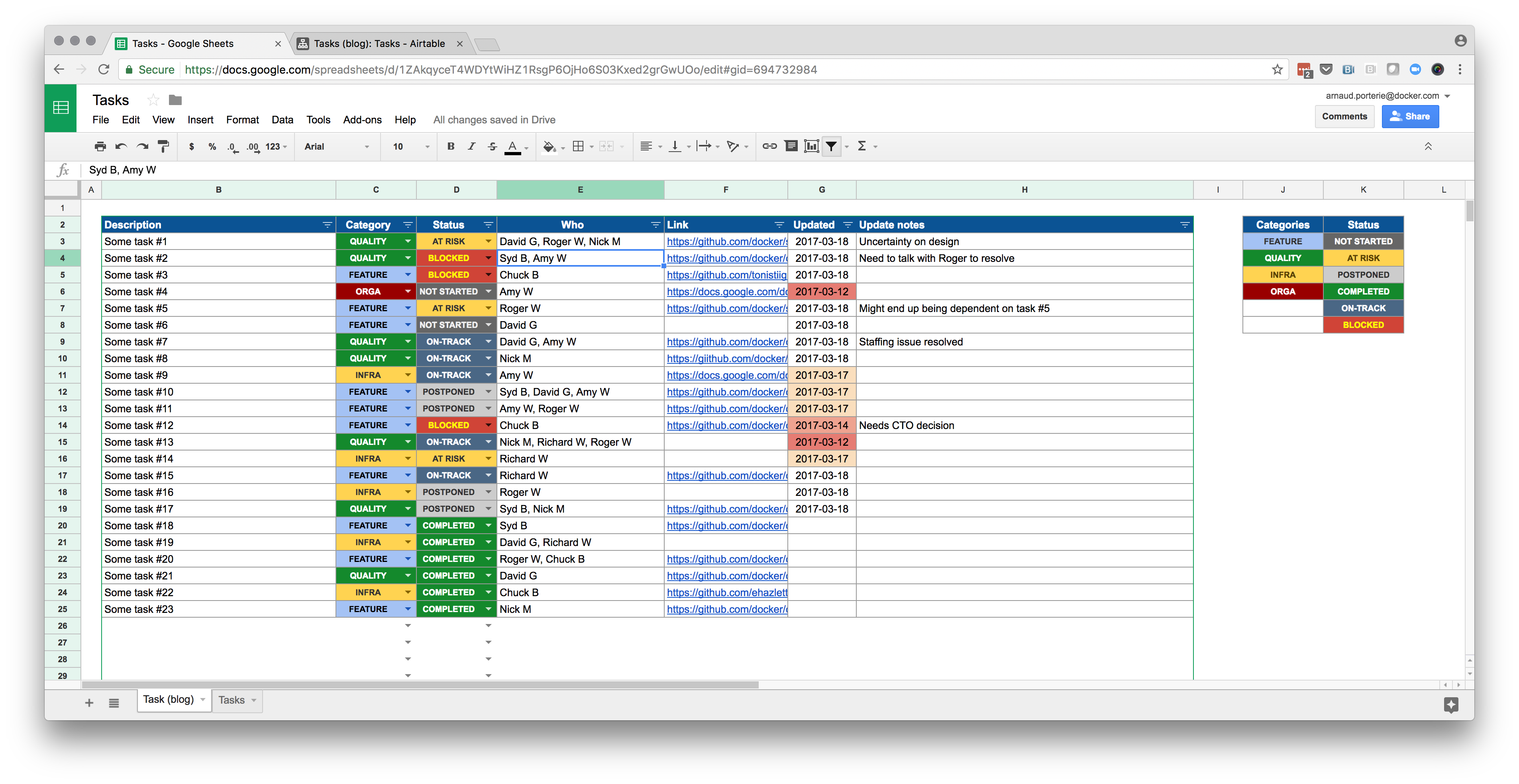
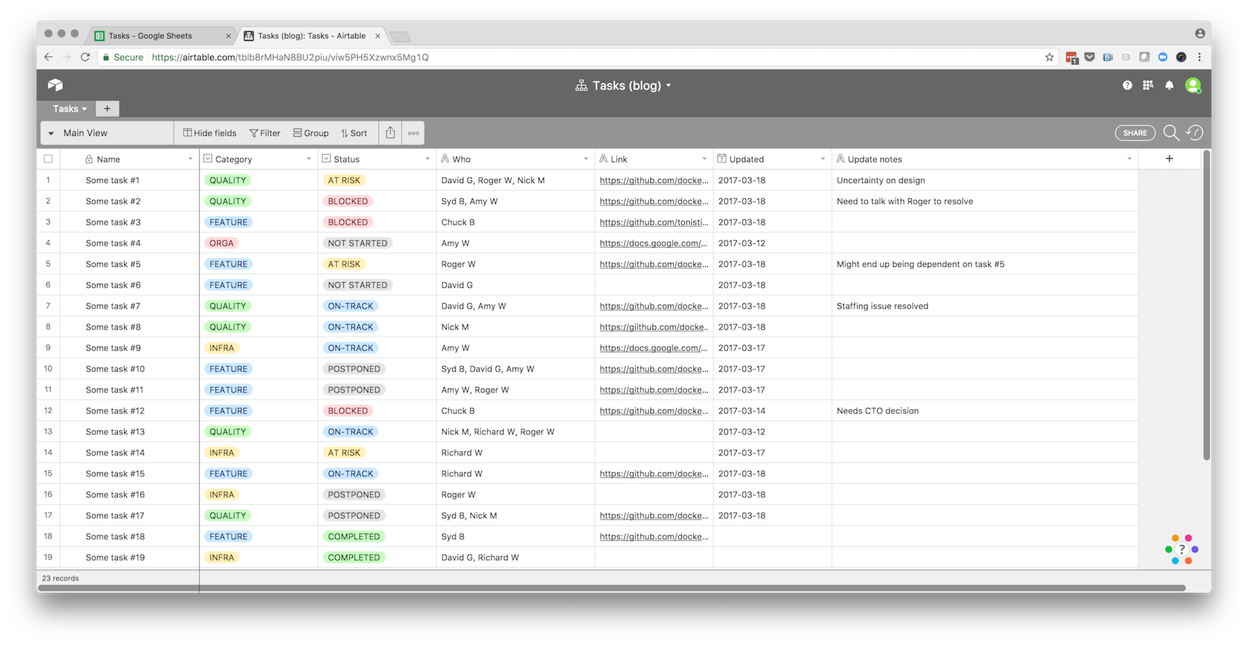
What we’ve done is a heat map of the activity of teams against different buckets of work, striving to stay away from technical jargon, and keeping it connected to desired business outcomes to the best of our ability. We’ve done it as anyone else would: with spreadsheets, duct tape, and many discussions. The template looks like this (in our case the number of individual product teams was over 50):

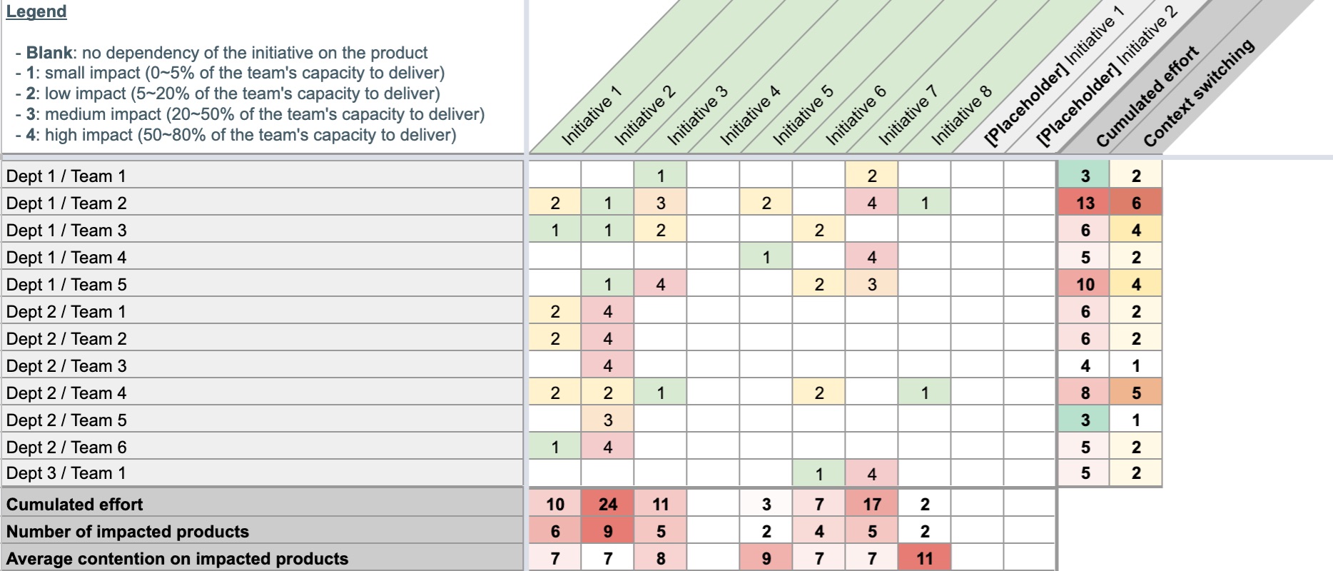
The table captures the allocation of work over a given period of time, and is assembled purely from discussions with Engineering Managers and Product Managers throughout the organization. The number in each cell is a very rough estimate of the effort dedicated by each team on each initiative, as indicated by the legend in the top left corner. It was deliberately sized in such a way that a given team may have a single contribution with a weight of 4, or two contributions with a weight of 3, but that more would likely indicate overcommit. It’s not intended to be exact, but to approximate the reality of our activity, and the accompanying challenges in terms of alignment and focus.

How you define the buckets of work (i.e., the columns) is naturally crucial. If you have adopted a product organization (such as described by Marty Cagan), chances are that a given team’s activity is going to be a mix of:

  • Its own initiatives, made of the solutions to be experimented, deployed, or improved as collectively devised to address customer needs under the leadership of a Product Manager, and in accordance with some form company objectives. A split per company objective or top-level OKR can be interesting here where it makes sense.
  • Some amount of top-down topics, which are typically already thought through and prioritized but require commitment from multiple teams to succeed. These can be either coming from business or tech itself (e.g., migrations).

The resulting table is certainly not rocket science but turned out to be quite the right level of granularity for many constructive discussions:

  • Top-down initiatives are expected but having the majority of your product teams’ effort allocated to them is not a good sign: it begs the question of individual teams empowerment and the true autonomy of Product Managers.
  • The more initiatives a given team is contributing to, the more likely it will fail delivering on some combination of them. One can argue that a high number of small-ish things is fine, but experience shows it rarely is: context switching has a cost, and the likelihood of one of these small-ish things to reveal itself as a Pandora’s Box cannot be ignored.
  • For a given initiative, the number of impacted teams is of interest, if only as a proxy of the amount of coordination it will require, but more important is the existing contention of teams on its path. It sometimes takes a single team’s miss for an entire initiative to fail, and that risk grows as teams are spread thinner.
  • It’s a good model for examining roughly the “compatibility” of an initiative to be potentially started with the existing workloads on the team, or the inverse results of stopping one.
  • It’s a good model to support discussions of technical coupling and the value or architectural work (which could be the topic of an entire blog post itself) as it makes interdependencies more apparent.

Closing words

Engineering leadership has many facets and all companies are different, but one thing that I believe to be universally true is that good leadership is about helping your team succeed in any way you can. The biggest leverage won’t always be in your hands and might not be that much engineering related, but that doesn’t make it any less your responsibility. In this journey, being a good advocate for the team often starts by being able to communicate effectively on its activity and on its challenges.

Where on this graph would you position your happy zone?
Where would your team members position theirs?

On the vertical axis is the load of work, ranging from easily manageable at the bottom, to impossible to complete in its entirety under reasonable working hours (a.k.a., “some balls will be dropped”) at the top. On the horizontal axis is the feeling of comfort, ranging from highly uncomfortable (a.k.a., “I have no idea what I’m doing”) on the left, to highly comfortable on the right.

Let me start by ruling out any sort of value judgement here. A given team would most likely see its people distributed throughout the graph, and there certainly would be both positive and negatives things to say about all of these individual traits. I’m quite sure we could argue that effective teams are actually quite balanced in this regard, in the same way that every team needs a tank, a healer, a damage dealer, someone with crowd control abilities, and another who knows iptables.

If I were to draw my personal happy zone, it would probably look like this:

As time goes by

Load at any given time is a function of one’s positioning and the company’s current phase. Ask any early employee in a startup experiencing hyper growth and they are most likely to tell you that everyone’s load is way above individual capacity regardless of their role. However we can assume the load will eventually converge as the company matures to what each position requires. Ultimately, we can expect load at any given position in a mature company to remain reasonably constant.

Comfort however will inevitably drift to the right as mastery grows in a given position, regardless of the level of load.

Conversely, internal mobilities (both lateral and promotions) will be a sudden push to the left as some amount of comfort is lost. Last but not least: people change, life happens, and it would incorrect to assume that the zone itself won’t move over time, albeit more slowly than companies and organisations evolve.

Only a Sith (or a bad manager) deals in absolute

Happiness at work is directly tied to the current distance to your preferred zone, but temporarily stepping out is fine as long as you can see the way back. For a most common example: taking a new position might put you way beyond your acceptable level of discomfort, but that’s something you may accept as long as you can see yourself progressing back toward your happy zone in the context of the new position.

It’s crucial however as an engineering manager to understand where your team members expect to be versus where you are asking them to be. I’ve seen people entirely reconsider their worth and competency purely because an organisational context had put them too far of their zone for too long: a very direct path to burnout. Related to that is the important realisation that an untenable distance to the happiness zone can be created in every direction: too little to do can be as detrimental as too much to do depending on the person.

Everything these days have labels: emails, GitHub issues and pull requests, todo list items, saved articles, etc. More importantly, labels often are the only available tool for classification. Yet, bad labels can increase clutter and confuse more than they inform.

In this post I’ll make a case for structuring labels, using GitHub issues and pull requests labels as an example.

Sending the right message

One label, two meanings

It’s often underlooked that a label has two meanings: one when it’s applied, and one when it isn’t. A label adds a piece of information not only to items that bear it, but also by contrast to items which don’t. One striking example is the help wanted label on GitHub: using this label on any subset of items conveys (deliberately or not) that help is not desired on the others.

Take the time to consider the implicit classification of unlabeled items. When help wanted exists as a label, the default situation is implicitly that help isn’t wanted. Rename this label to help not needed and you just reversed that perception. Such details may be of importance when aiming to build a welcoming project.

The label soup

The default set of labels on GitHub is the following: bug, duplicate, enhancement, help wanted, invalid, question, wontfix.

The problem with a flat collection of labels is that there’s no obvious purpose, and no explicit relationship between them. For example, which labels are mutually exclusive? It might be generally accepted that an issue is either a bug or an enhancement, but what about question? Can I have a bug question and an enhancement question? What about a invalid question?

A flat collection of labels is an heterogenous pool of values to pick from: like anything which doesn’t have clear intent, it becomes subject to interpretation. Luckily, we have a nice tool to give meaning to values: types!

A structured approach to labeling

Thinking with types

If you were writing code, how would you define a type to hold the metadata you care about? Taking an imaginary set of labels as an example, this is what the typical label organization would look like when expressed as code:

1
2
3
4
5
6
7
8
9
10
11
12
13
type Label int

const (
    API Label = iota
    Bug
    CodeReview
    DesignReview
    Networking
    Question
    Storage
)

type Metadata []Label

For those unfamiliar with Go, this is simply defining a Label enumerate, and the Metadata type as a collection of Label values.

That’s the “label soup” described above, but we can be more expressive about the intent and constraints:

1
2
3
4
5
6
7
8
9
10
11
12
13
14
15
16
17
18
19
20
21
22
23
24
25
26
27
28
type Area int

const (
	API Area = iota
	Networking
	Storage
)

type Kind int

const (
	Bug Kind = iota
	Feature
	Question
)

type Status int

const (
	DesignReview Status = iota
	CodeReview
)

type Metadata struct {
	Areas  []Area
	Kind   Kind
	Status Status
}

The Metadata type properly captures that a given item can have multiple areas, a single kind, and a single status. Similarly, it’s now clear that an item is either a Bug, a Feature, or a Question.

Expressing as labels

Now armed with the model we want, we need a way to represent it with labels. Labels are typically just strings, so we need some kind of micro-format: the way it’s set up on the Docker project and what I use throughout my tools is a straightforward field/value syntax.

Area Kind Status
areas/api kind/bug status/design-review
areas/networking kind/feature status/code-review
areas/storage kind/question  

This gives us quite a different approach to labeling: setting a label is assigning a value to a named field of a metadata type. The intended structure:

1
2
3
4
5
Metadata{
    Areas:  []Area{ API, Networking },
    Kind:   Bug,
    Status: CodeReview,    
}

… translates to the following set of labels: areas/api, areas/networking, kind/bug, status/code-review. Easy enough!

Of course, none of the services I know would technically enforce that an item can have multiple areas/ but a single kind/. The best we can do is rely on the added explicit purpose on each label, and on the pluralization of areas/ field name to signify a list over a scalar value. On the Docker project, we took the extra step of documenting the labels.

As a bonus: structured labels make it way easier to visualize data according to specific attributes. For example breaking down GitHub issues into areas, kind, and version:

Issues breakdown.

Summing up

Whether on GitHub issues, emails, todo list tasks, or unread articles, labels are often are only tool provided for classification, and getting them right is key to being able to manage large sets of items. Take the time to consider their explicit and implicit meanings, and how much is subject to interpretation. A structured approach to labeling can truly help here.

As the implementer of a service that supports labels, define the default set wisely. And if it happens that your service is targeted at a technical audience, I think it’s worth exploring how a labeling system could embrace a structured approach and offer the ability to specify a model in order to enforce constraints.

I work in a fast paced startup as the manager for a dozen (amazing) engineers who typically deal with 2 to 5 simultaneous tasks at any given time. As a result, one aspect of my job is to keep track of all of those items and know:

  • What we’re doing, and what’s the current status.
  • Who is involved on each, and whether the load is appropriately distributed.
  • Whether the team needs help to make progress.

I’ll use this specific example to describe how I moved away from spreadsheets in favor of Airtable and what it buys me.

Your typical spreadsheet

Here’s a simplified and anonymized version of the spreadsheet I had been using so far:

Task management spreadsheet.

All the information is there, but:

  • Getting from zero to a spreadsheet like this one takes some time. You need to structure as a table, set up data validation, set up conditional formatting.
  • Maintenance is painful: for example adding a category requires updating the scaffolding accordingly.
  • Data cannot easily be queried: filtering allows to narrow down to a subset of categories or statuses, but that’s basically it.

In other words, there’s some overhead and hygiene involved in making a spreadsheet behave like a database.

Introducing Airtable

I would describe Airtable as a relational database wrapped under a familiar and accessible spreadsheet UI. Where spreadsheets enforce no particular structure, every sheet in Airtable is really a table storing records under a well-defined schema . By design, implementing the example spreadsheet above in Airtable takes no more than a minute because the only effort resides in the schema definition: once done the UI is meant to manage records according to that schema.

We’ll start with Airtable’s ability to import existing data (either through CSV or copy/pasting fields), go through each column to update its data type (hence defining our schema), and tada:

Migrating to Airtable.

At this point it may seem like we traded one UI for another, but there are already concrete benefits:

  • We get a nice form UI for adding and managing records.
  • The table structure and schema are enforced.
  • Maintenance is trivial: for example, I can add a category in a second.

But it’s gets much better.

Leveraging views

Airtable has a straightforward UI for grouping and sorting: pretty much Pivot Tables for humans. For example, we can trivially group tasks by category, and sort by ascending update date.

Grouping by category.

From there you can persist the settings as separate views and even create non-grid views, such as a Kanban board.

The Kaban view.

Leveraging relations

Let’s see how the “relational” dimension of Airtable can help us improve further. So far the “Who” column is just free text: we can create a “Team” table with the team members, and convert the “Who” colum to a Linked Record.

Leveraging relations.

The “Who” column being a linked record gives you everything you would expect from a relational database. Airtable’s UI is again really key here, as it’s trivial to select a record from the People table from the Tasks table, and even create new People entries as a task is being added.

More importantly, Airtable automatically created the other side of the relationship in the People table: we basically get the list of task assigned to each individual team member for free.

The other side of the relation.

Summing up

Spreadsheets are great, but for anything that ressembles a database with structured records the boilerplate for the initial setup and maintenance cannot be ignored. This is one aspect where Airtable really shines: by providing a familiar spreadsheet-like UI to what is really a relational database under the hood, it eliminates a lot of the overhead while providing some immensely valuable benefits.

In this post we only scratched the surface: a thousands more things can be achieved when you start digging in Airtable’s API. More advanced use cases have been described by Simon Eskildsen on his blog.

I’ve been reading composition books and blogs in an attempt to discover new ways to organize the frame. One of those ways that I’m currently experimenting with is called dynamic symmetry, and is discussed extensively on James Cowman’s blog.

In this post, I’m exploring how to add the dynamic symmetry grid as a custom overlay in Lightroom.

Lightroom Loupe Overlays

At the time of writing, Lightroom CC is in version 2015.5.1 (1073342).

Lightroom comes with several crop guide overlays, but unfortunately the dynamic symmetry grid isn’t part of them. Although there is no way at the time of writing to customize the overlay grids, another feature can be exploited as a workaround: loupe overlays.

The original goal of this feature is to put an image in its context of use, such as adding all the surrounding text of a magazine cover. You will find this under the View menu:

The Loupe Overlay menu.

By creating a set of custom images, we can use this feature to our advantage to overlay a dynamic symmetry grid, using the Command + Option + O shortcut to toggle it:

The Dynamic Symmetry overlay.

Issues and limitations

At the time of writing, the feature is unfortunately super buggy, and seems to crash Lightroom only minutes after being enabled for the first time.

Another minor problem is that loupe overlays doesn’t follow the image orientation. In other words, you need both a horizontal and vertical grid images and manually switch between the two.

Download the overlay files

I created different flavors of the grid, for either light or dark lines, and horizontal or vertical orientation: